上一篇通过GEE实现对双季稻和单季稻的分类,从中不难看出GEE具有强大的遥感大数据处理能力及高度集成化的功能接口,非常适用于大区域遥感应用。然而,对于示范区域较小且需要实现更多定制化功能的情况下,依然需要了解基于Python如何实现,尤其是针对shape文件的一些交互操作依然是初学者的难点。本文基于与上一篇相同的数据利用Python复现单季水稻和双季水稻的分类过程。
需要说明的是分享案例旨在交流方法的编程实现,应用精度主要取决于样本,而本例中并未对样本进行严格筛选。
基于时间序列遥感的水稻类型识别-P2
地物的光谱信息是遥感数据的重要特征,对遥感光谱信息的利用经历了从全色影像到多光谱、高光谱再到时间序列的发展历程。近年来,随着卫星遥感的发展和历史数据的积累,获取了大量的重复观测数据。长时序的遥感数据包含光谱维、时间维和空间维四个维度的信息,能够在一定程度上避免“同谱异物”、“同物异谱”的现象,在地物分类、变化检测等方面有广泛应用。本案例基于2022年度的哨兵二号长时间序列数据构建NDVI时序立方体,利用随机森林算法实现对研究区双季水稻和单季水稻的分类提取。
1. 时序光谱数据读取
import matplotlib.pyplot as plt
from PIL import Image
import numpy as np
from osgeo import gdal, osr, ogr, gdalconst
import os,glob,time
from utils import * #之前分享过的function都放到了utils里,此文档不在展示,文末回复关键字获取
img_arr, im_geotrans,im_proj,band_name =read_Image('./data/ndvi_combine.tif')
n=len(band_name)
img_arr.shape(28, 11076, 12541)显示时序影像
num = img_arr.shape[0]
plt.figure(figsize=(30,(num//5 + 1)*6))
for i in range(num):
    ax = plt.subplot((num//5 + 1),5,i+1)
    ax.set_title(band_name[i])
    ax.imshow(img_arr[i,:,:])
plt.show().png)
2. 光谱特征分析
研究区双季稻生长期安排因受气候条件的制约相对固定, 大致从每年3 月下旬到10月下旬, 而单季稻生长期安排相对自由, 且全生育期略长, 一般从5月中上旬到10月上旬。下图展示了年内不同熟制水稻武侯历,A为早稻、B为晚稻、C为单季稻,参考1、2。
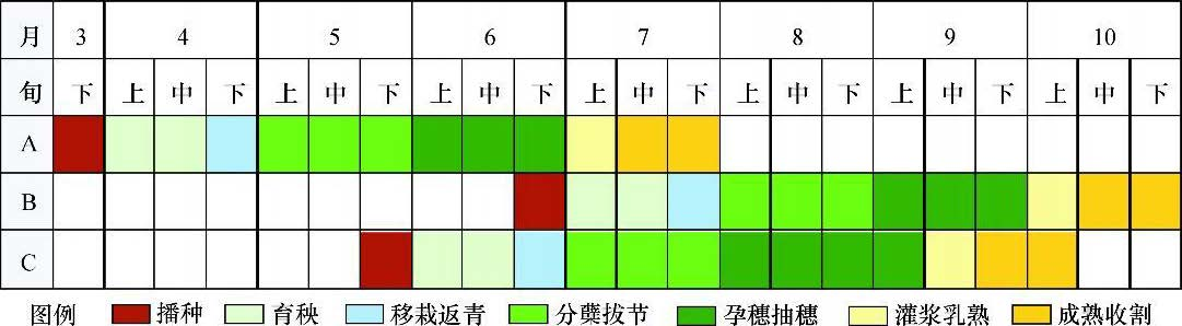
图中绿色部分为水稻生长旺盛期,对应DNVI较高,因此以9月中旬,4月下旬及10月构建假彩色影像可大致区分单双季水稻。
# for i in range(28):
#     print(str(i)+'_'+band_name[i])
## 坐标转图面坐标
def geo2imagexy( x, y,trans):
'''
根据GDAL的六 参数模型将给定的投影或地理坐标转为影像图上坐标(行列号)
:param dataset: GDAL地理数据
:param x: 投影或地理坐标x
:param y: 投影或地理坐标y
:return: 影坐标或地理坐标(x, y)对应的影像图上行列号(col,row)
'''
a = np.array([[trans[1], trans[2]], [trans[4], trans[5]]])
b = np.array([x - trans[0], y - trans[3]])
out = np.linalg.solve(a, b)
return out[1], out[0]
## 显示折线图
def show_broken_line(data,label,mode):
data = np.squeeze(np.array(data))
x = np.arange(len(data))
plt.style.use('ggplot')
plt.figure(figsize=(12,5))
plt.plot(x, data,linestyle=":",color='darkviolet',linewidth = '2' )#, label="1", linestyle=":")
plt.xticks(x,labels=label,rotation=60)
plt.title(mode+"cropping")
plt.ylabel("NDVI")
plt.show()quicklook=img_arr[[19,5,24]]
Write_Tiff(quicklook,im_geotrans,im_proj, './data/quickimg.tif')plt.figure(figsize=(10,6))
plt.imshow(quicklook.transpose(1,2,0))
x1,y1=(116.40917424,28.68150022)
x2,y2=(116.27280998,28.71303109)
px1,py1=geo2imagexy(x1,y1,im_geotrans)
px2,py2=geo2imagexy(x2,y2,im_geotrans)
# print(px1,py1,px2,py2)
plt.plot(px1,py1,'*r')
plt.plot(px2,py2,'*r')
plt.show().png)
展示在给定坐标位置的情况下,展现典型单季和双季水稻的时序曲线,双季呈现出双峰态,由于6月份数据受云影响较大,有效数据较少导致第一个峰略窄,单季是4-8月间的单峰态。
ndvi_line1=img_arr[:,round(px1),round(py1)]
ndvi_line2=img_arr[:,round(px2),round(py2)]

show_broken_line(ndvi_line1,band_name,'Multiple-')
show_broken_line(ndvi_line2,band_name,'Single-').png)
.png)
3. 样本构建及机器学习推理
3.1 矢量内生成随机点
- 借助Arcgis或ENVI工具对照前面的假彩色影像来圈定采样区域,可以利用矢量勾绘功能圈定单季稻、双季稻以及其他地物类范围,再分别在各类图斑内生成随机采样点用于训练机器学习分类器;
- classpoint.shp共有30000个采样点,每类分别有10000个采样点,通过属性’label’作为类别标签,显示结果如下图, 图中黑色点为双季稻样本,红色点为单季稻样本,蓝色点为其它地类样本。
import rasterio,rasterio.plot
import geopandas as gpd
import matplotlib.pyplot as plt
import random,glob
from shapely.geometry import Point,Polygon
from geopandas import GeoSeries,GeoDataFrame
import pandas as pd


def random_points_in_polygon(number, polygon):
    points = []
    min_x, min_y, max_x, max_y = polygon.bounds
    i= 0
    while i < number:
        point = Point(random.uniform(min_x, max_x), random.uniform(min_y, max_y))
        if polygon.contains(point):
            points.append(point)
            i += 1
    return points  # returns list of shapely point

def point_generator(polygon,sampleno):
    geodata = gpd.read_file(polygon)
    points = random_points_in_polygon(sampleno, geodata.iloc[0].geometry)
    # Plot the list of points
    xs = [point.x for point in points]
    ys = [point.y for point in points]
    # for i, point in enumerate(points):
    #     print("Point {}: ({},{})".format(str(i+1), point.x, point.y))
    return xs,ys,geodata

def gdf_creat(xs,ys,label):
    df = pd.DataFrame()
    df['points'] = list(zip(xs,ys))
    df['points'] = df['points'].apply(Point)
    gdf_points = gpd.GeoDataFrame(df, geometry='points', crs="EPSG:4326")
    gdf_points1=GeoDataFrame({'label' : np.zeros(df.size,dtype=np.int8)+label}, geometry=df['points'])
return gdf_points1shp=glob.glob('./data/shp/*.shp')
label=[0,1,2]
colorc=['yellow','blue','green']
colorp=['green','red','blue']
fig, ax = plt.subplots(figsize=(10,10))
fig.suptitle('Random Sampling', fontsize=32)
ax.grid(False)
img=rasterio.open("./data/quickimg.tif")
p1 =rasterio.plot.show(img, ax=ax)
for index,i,j in zip(range(len(shp)),shp,label):
xs, ys,geodata=point_generator(i,1000)
point=gdf_creat(xs,ys,j)
geodata.plot(ax=ax,color=colorc[index],alpha=0.5,edgecolor='black')
ax.scatter(xs, ys,c=colorp[index],s=2)
out_path='./data/point/point_'+str(index)+'.shp'
point.to_file(out_path).png)
3.2 样本集构建
获取随机点的经纬度,以此为媒介获取影像的像元值,将同一坐标对应的像元值与lable合并构成训练样本
# 得到每一个点要素的经纬度坐标,以及label值
def Read_Point_Location(shppoint,img,ifshpfile=False,Field = "label"):
    if ifshpfile:
        shppoint=gpd.read_file(shppoint)
    else:
        Sample_array = np.zeros((shppoint[Field].size,3),dtype=np.float32)
        Sample_array[:,0] = np.array(shppoint.geometry.x)
        Sample_array[:,1] = np.array(shppoint.geometry.y)
        Sample_array[:,2] = np.array(shppoint[Field])
    return Sample_array

# 根据点的坐标提取影像中对应的栅格值,类似于arcmap中“值提取至点”功能
def Ectract_Value_to_Point(geotrans,image,Sample_array):
    newarray=np.zeros((Sample_array.shape[0],image.shape[0]))
    Left = geotrans[0]   #图像左上角经度
    Up = geotrans[3]     #图像左上角纬度
    long_res = geotrans[1]
    lat_res = geotrans[5]
    for i in range(Sample_array.shape[0]):
        long = Sample_array[i,0]
        lat = Sample_array[i,1]
        # 得到该坐标与图像左上角坐标的相对位置
        col_offset = int((long - Left)/long_res)
        row_offset = int((lat - Up)/lat_res)
        # if row_offset >= image.shape[1] or col_offset >= image.shape[2]:
        #     break
        for j in range(image.shape[0]):
            newarray[i,j] = image[j,row_offset,col_offset]
return newarraypoints=glob.glob('./data/point/*.shp')
point0=gpd.read_file(points[0])
point1=gpd.read_file(points[1])
point2=gpd.read_file(points[2])
pointall=pd.concat([point0,point1,point2])
# pointall.to_file('./data/all_point.shp')# 得到每一个点要素的经纬度坐标,以及label值
point_array=Read_Point_Location(pointall,img_arr)
# 根据点的坐标提取影像中对应的栅格值,
extract_array = Ectract_Value_to_Point(im_geotrans,img_arr,point_array)
training=np.concatenate((extract_array,point_array[:,-1:]),axis=-1)
extract_array.shape,point_array.shape,training.shape((1500, 28), (1500, 3), (1500, 29))值得注意的是圈定样本只是大概的区域,其中会混入目标地物引起错分;因此,建议此处获得样本再通过设定一些阈值筛选一遍,过滤掉错误样本。方法相对简单,再次不再展示。
4. 模型构建及推理
划分训练及测试样本集,训练随机森林模型
from sklearn.model_selection import train_test_split
from sklearn.ensemble import RandomForestClassifier
from sklearn.metrics import confusion_matrix

xtrain,xtest,ytrain,ytest=train_test_split(training[:,:-1],training[:,-1],test_size=0.2,random_state=42)

# 设置随机森林模型中的树为100
clf = RandomForestClassifier(n_estimators=50,bootstrap=True, max_features='sqrt')
clf.fit(xtrain,ytrain)RandomForestClassifier(n_estimators=50)In a Jupyter environment, please rerun this cell to show the HTML representation or trust the notebook.
On GitHub, the HTML representation is unable to render, please try loading this page with nbviewer.org.
RandomForestClassifier(n_estimators=50)
def acc_assess(matrix):
    TP,FP,FN,TN = matrix[0,0],matrix[0,1],matrix[1,0],matrix[1,1]
    precision = TP/(TP+FP)
    recall = TP/(TP+FN)
    f1 = 2 * precision * recall / (precision + recall)
    return f1
y_pred = clf.predict(xtest)
matrix = confusion_matrix(ytest, y_pred)
F1= acc_assess(matrix)
print("F1:%0.4f" % F1)F1:0.9557pred_arr=img_arr.reshape(img_arr.shape[0],img_arr.shape[1]*img_arr.shape[2])
pred_arr=pred_arr.swapaxes(0,1)
pred_arr.shape(138904116, 28)# 模型预测
pred = clf.predict(pred_arr)
pred = pred.reshape(img_arr.shape[1], img_arr.shape[2])
pred = pred.astype(np.uint8)palette = np.array([ [255,250,205],[60,179,113],[65,105,225]]) #自定义colorbar,用于分类结果的显示,非常实用
color=palette[pred]
fig, ax = plt.subplots(1,2,figsize=(12,10))
plt.subplot(1,2,1),plt.title('NDVI'), plt.grid(False)
plt.imshow(quicklook.transpose(1,2,0))
plt.subplot(1,2,2),plt.title('Prediction'), plt.grid(False)
plt.imshow(color)<matplotlib.image.AxesImage at 0x1e51e9013a0>.png)
Write_Tiff(pred,im_geotrans,im_proj, './data/prediction.tif')想了解更多请关注[45度科研人]公众号,欢迎给我留言!